Monstroid
Theme Settings
In order to manage general theme setting, navigate to Online Store -> Themes and click Customize button at the top right corner.
On the Customizer page, scroll to the bottom of the screen, click on Theme settings.
Typography
The section where you can change the typography settings, such as font family, font size and color. You can modify the following settings:
Base Font
Here you can change the main font style of your store pages.
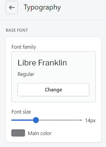
- Font family — choose a font family;
- Font size — set a font size (max 14px);
- Main Color — choose a color for the main font. You can select a color from the Color Palette.
Heading Font
Here you can manage the title font style.
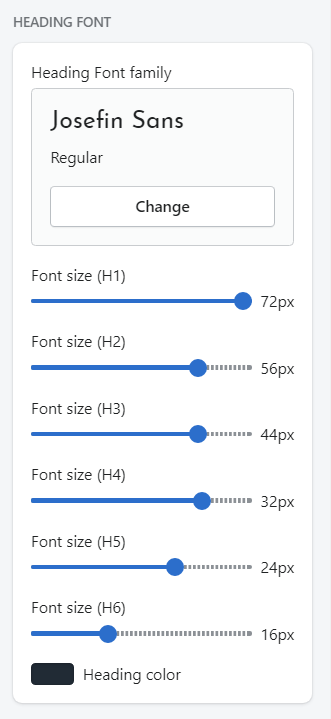
- Heading Font Family — choose a font family for the heading;
- Font size (H1) — set a font size for H1 (max 72px);
- Font size (H2) — set a font size for H2;
- Font size (H3) — set a font size for H3;
- Font size (H4) — set a font size for H4;
- Font size (H5) — set a font size for H5;
- Font size (H6) — set a font size for H6;
- Heading Color — choose a color for the Titles. You can select a color from the Color Palette.
Links
Here you can set links text color.
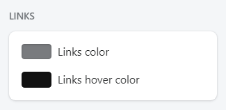
- Links color — choose a color for the Links. You can select a color from the Color Palette;
- Links hover color — choose the link color when the mouse is moved over the link.
Product Name
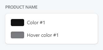
- Color #1 — choose a color for the product name. You can select a color from the Color Palette;
- Hover Color #1 — choose the product name color when the mouse is moved over the name.
Product Price
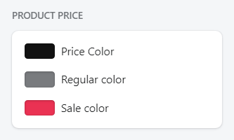
- Price Color — choose a color for the product price;
- Regular Color — choose a color for the regular product price;
- Sale Color — choose a color for the product on sale.
Color
In this section, you choose the colors for your site. The colors must be specified in hexadecimal format (for example, #aabbcc). Also, it is possible to select a color from a palette provided.
The section includes such subsections: Page Colors, Main Colors, Adjective Colors, Alerts Colors, Default Button, Primary Button, Secondary Button.
- Page Colors — option controls the Page background color, Page Main Color, and Border color.
- Main Colors — option controls the Primary, and Secondary colors of the store.
- Additional Colors — set extra colors.
- Alerts Colors — highlight colors for the important texts of high value, or notifications as: info, success, warning, and danger.
- Default Button — is used for default button styles: button text, background, border color, and button hover states.
- Primary Button — use primary colors for primary actions like buttons, icons, and text on navigation and tabs, and for the background in navigation and tab interactive states.
- Secondary Button — use secondary colors for secondary and tertiary buttons and the background of form elements.
Favicon
Favicon is a small icon that serves as branding for your website.
Favicon image will be scaled down to 32 x 32px.
You can upload image from your computer or select image from your library.
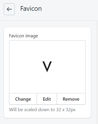
Select Change to modify the favicon. Click Edit to make some changes, or click Remove to delete the icon.
Sidebar
The sidebar section allows you to define whether to show the sidebar or not on the collection page and the blog page. You can also choose the right or left position for the sidebar.
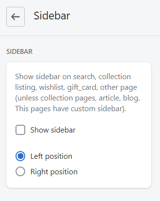
- Enable the Show sidebar option to display sidebar.
- Choose the sidebar position (Left or Right).
- Remember to Save the settings.
Wishlist
A wishlist is an eCommerce feature that allows shoppers to create personalized collections of products they want to buy.
Wishlist tab provides an option to enable wishlist functionality. You can also create a Wishlist page using the "page.wishlist" template, and select it here.
Create the new page
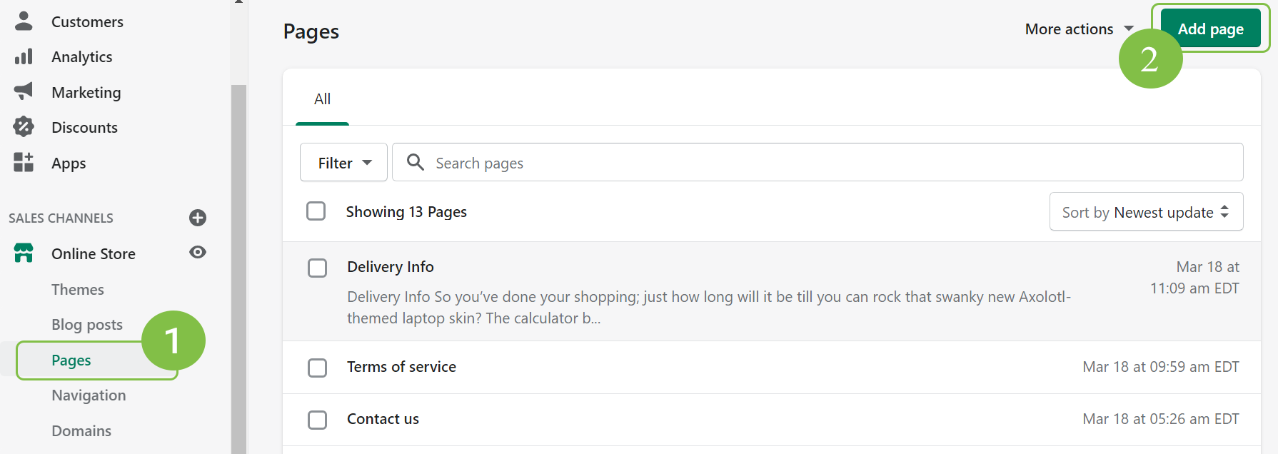
1. Login to you Shopify store Admin Panel and go to Online Store, then tap Pages. Click the Add page button.
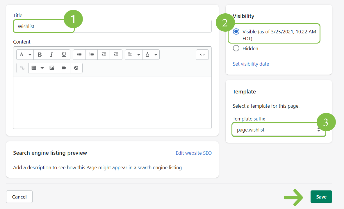
2. Enter the Title for the page (1). Note, the title is visible on the frontend.
Set the page as Visible (2) and select the template for this page (3).
Save the page.
Let's review the options available:
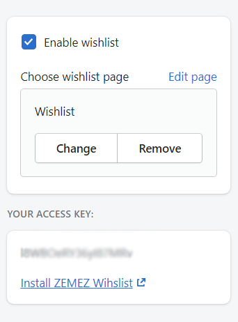
- Activate the Enable wishlist option to use the "Wishlist" functionality for your store.
- Then choose the page for the wishlist.
Remember to Save the settings.
Settings for the Wishlist Page
- Product image size — set the products image size (Amall/Medium/Large)
- Product image alignment — choose the alignment type for the product images
Pages and Layout
This block allows setting the options for pages and Header and Footer layouts.
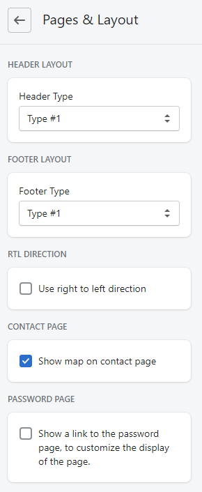
- Header Layout
- Footer Layout
- RTL Direction - Shopify supports Right-to-Left languages such as Arabic and Hebrew.
- Contact Page
- Password Page
Security
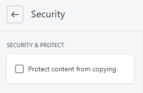
You can protect your store content from copywriting by checking the box.
Newsletter
Email newsletter has always been the important part of every marketing strategy. Displays the popup window with subscription form right after the client visits your site.
Newsletter tab allows you to access the subscription settings via Shopify native form or Mailchimp depending on your choice.
You may also enable and configure a pop-up window for the subscription, selecting its display frequency (in days) and adding text and the background image.

- To display the labels, you should first activate the Enable newsletter popup option.
- Pop-up disable expiration (in days) — set the number of days to show the pop-up again after the user clicks the 'Don't show this message again' button.
- Newsletter Popup Type - set the type of the newsletter.
- Newsletter Header - write down a newsletter popup title.
- Discount Percent - set a discount
- Newsletter Description - write down a newsletter popup message.
- Background image — download the background image for the newsletter. The image size should be 400x530px.
Product
Here you can manage the main Product settings.
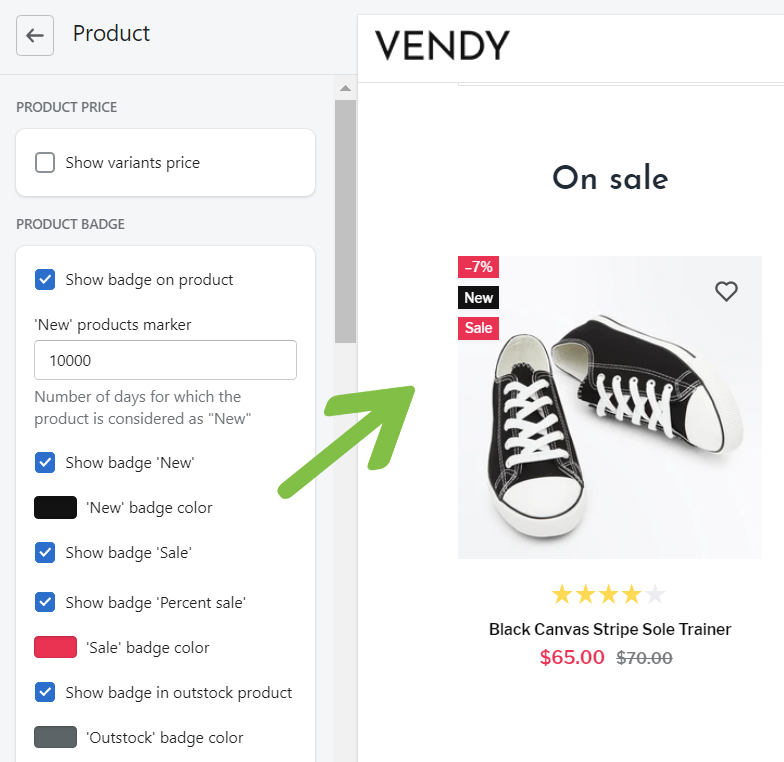
- Product price - Show variants price.
- Show badge on product - you can set the following badges for your store:
- New
- Sale
- Percent sale
- Badge out of stock
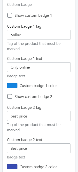
- Custom badge - you can set specific badges for your products. Like: "Online online", "Best price", etc.
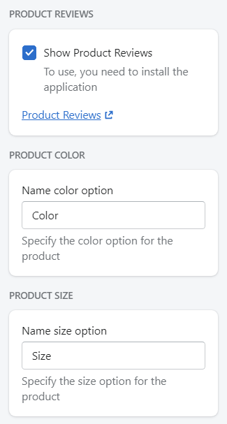
- Product reviews - to show the products review you need to install an official Shopify App Product Review.
- Product Color - specify the product color.
- Product Size - specify the size option for the product.
Social Sharing Buttons
You can show your social media icons on the Product Page.
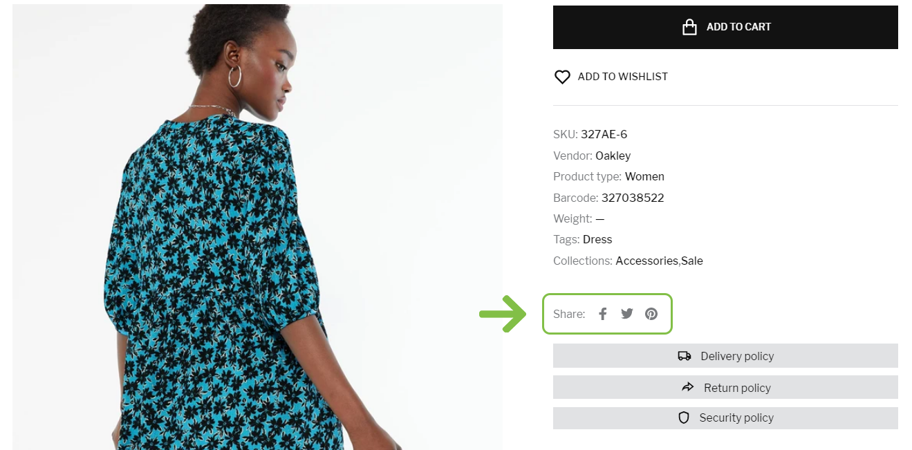
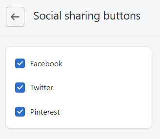
Show/Hide product social sharing buttons. In order to hide the social share button, disable the Checkbox.
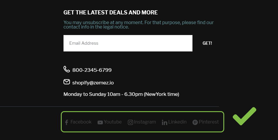
Social Link
You can display social links in Header and Footer areas like Facebook, Twitter, YouTube, Instagram, Pinterest, Linkedin in the footer area of your online store.
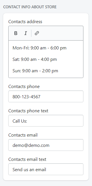
Contact Info Block
Contacts info block allows you to display the section with specified address, the office hours, phone number in the footer.
Checkout
This section presents the appearance settings for the order page. You can customize the banner, logo, page title, as well as the buttons color.
Let's review the Checkout configuration:
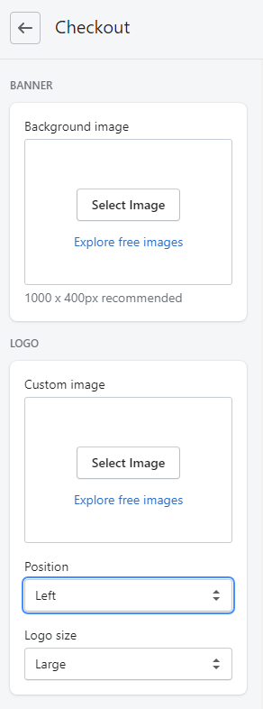
- Banner - set a background image. The recommended size is 1000 x 400px. You can upload image from your computer or select image from your library.
- Logo - set a custom image for Logo. You can upload image from your computer or select
image from your library.
- Position (Logo position) - select a suitable Logo position from the option dropdown (Left/Center/Right).
- Logo size - select a suitable Logo size from the option dropdown (Small/Medium/Large).
Main content area:
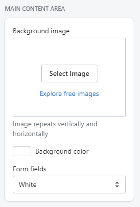
- Background image - set a background image. You can upload image from your computer or select image from your library. Image repeats vertically and horizontally.
- Background color - set a background image (in case Background image is disabled). You can select a color from the Color Palette.
- Form fields - use this field if you want to have Form fields white or transparent.
Order summary:
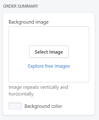
- Background image - set a background image. You can upload image from your computer or select image from your library. Image repeats vertically and horizontally.
- Background color - set a background color (in case Background image is disabled). You can select a color from the Color Palette.
Typography:
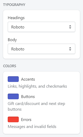
- Headings - choose a font family for headings from the dropdown.
- Body - choose a font family for the checkout main text from the dropdown.
Colors:
- Accents - choose a color for links, highlights, and checkmarks. You can select a color from the Color Palette.
- Buttons - choose a color for gift card/discount and next step buttons. You can select a color from the Color Palette.
- Errors - choose a color for messages and invalid fields. You can select a color from the Color Palette.
